
RelativityOne - Jobs page (Processing)
Relativity Processing helps users load their data onto the platform to discover the truth. The introduction of the Jobs page gives users a central hub within Processing to understand where their data is and the next action to take on this data.
Team: Nick Manoogian, Ashley Bui, Marissa Lewellen, Danny Frank, Apollo engineering team
Role: Lead UX designer
Tools: Figma, Figjam, Lucidchart

The problem
Today in processing the user flow to import data is too cumbersome for users wanting to upload any amount data. Whether it is the frustration of constant jumping from one section to another to initiate processing or the lack of real time updates to what is happening to their data, users are lacking the confidence that they are in control.

The process
Discovery - User Research, Journey Mapping, Value Proposition
Synthesis - Data Synthesis, Opportunity Ideation
Design - User Flow, Wireframes, Hi-fi Designs, Prototype
Testing - Usability testing (internal/external)
Iterations - Identify areas of improvement
Discovery - Framing the problem & gathering the evidence
Today in processing the user flow to import data is too cumbersome for users wanting to upload any amount data. Whether it is the frustration of constant jumping from one section to another to initiate processing or the lack of real time updates to what is happening to their data, users are lacking the confidence that they are in control.
Opportunity Assessment
-
Reducing the complexity of the processing job initiation workflow
-
Increase amount of data being discovered per client
Reduced number of support/solutions tickets
Reduced number of clicks to process data (Target 40%)
Increase NPS scores
-
Reducing barriers of adoption
Complex and extensive training and/or industry training required to understand Processing
Keeping the users data in one area to reduce the need to jump around product in order to process data
-
Corporate law firms
Small/Large law firms
Government
Groups without e-discovery experts
Service Providers
Relativity Support/Solutions
-

Value Proposition
The triad, consisting of UX, PM, & Engineering, created a simple statement that summarizes why a customer would choose our product or service. It communicates the clearest benefit that customers receive by giving us their business. We utilized this tool to drill down into the user pain points around importing their data. The key findings highlighted known issues today and surfaced areas that would benefit from the workflow overhaul.
No central location for imported data
Not enough information when a job is actually stuck
Expert level of knowledge needed to simply import
-

User Research
The triad conducted initial user feedback sessions based on today’s workflow paradigm that customers have grown accustomed to. Before setting up any interviews though, the triad met to formulate questions we would be asking and create a question map. The purpose behind this mapping was to prepare a line of questioning regardless of which route the customer used today. These questions serve more as a guide to help direct these interviews and not a script that needed to be followed.
-

Journey Mapping
A crucial part of the discovery process is to level-set our understanding of the current paradigm that exists in the product today. Working with the product manager we walked through the product and recorded the steps and clicks in an ideal scenario (no errors).
1 processing set
3 data sources in the processing set
Total clicks: 49
Synthesis - Digesting the data, to formulate ideas
Today in processing the user flow to import data is too cumbersome for users wanting to upload any amount data. Whether it is the frustration of constant jumping from one section to another to initiate processing or the lack of real time updates to what is happening to their data, users are lacking the confidence that they are in control.
Key Findings
-
One home
A key piece of information that was repeatedly being found across our user market was that the multiple areas to initiate data processing is a slow learning curve. Users stated that once it became familiar it was like muscle memory. Creating a central area where a job can be created, monitored, and sent to review is crucial for improved onboarding.
-
Communication, communication, communication
There is a big difference between something being stalled and it functioning properly. Often times, processing data can take hours and when there is no movement in the status, users begin to wonder if it is stalled or if it is just churning through the data. Communicating better status updates and notifications for users is crucial to building better trust.
-
Don't leave out advanced users
With the desire to make this default simple so the user no longer needs an e-discovery background to process their data, we must remember the users that have been working in the system. Optionally advanced is key for these users to be able continue organize their data.
Design - Building a solution for all
The design process included user flows, wireframes, hi-fi designs, and prototyping. We started this process as basic as possible and focused only on the current user journey and seeing where it was most repetitive and how to eliminate steps. Even though a complete overhaul was going to happen that no longer included the old pages, we still needed to bring to life a solution that would seem familiar to our users. When radically changing a workflow, it is important to keep in mind the obstacles for adoption. Without this type of foresight, the proposed solution can often bubble up to seem like an entirely new product.

In an early concept of what the user flow could look like we were able. to drastically reduce the amount of clicks for adding 3 data sources by 57% from the current flow they were using. Our main focus in this exercise was purely click reduction but we know that is not the only important aspect to designing a flow that is quick and easy but also one that the user understands. If the comprehension to what needs to be done in the task is lost from the beginning for the user then it doesn’t matter how much we reduce clicks by, they can’t even get through the job.
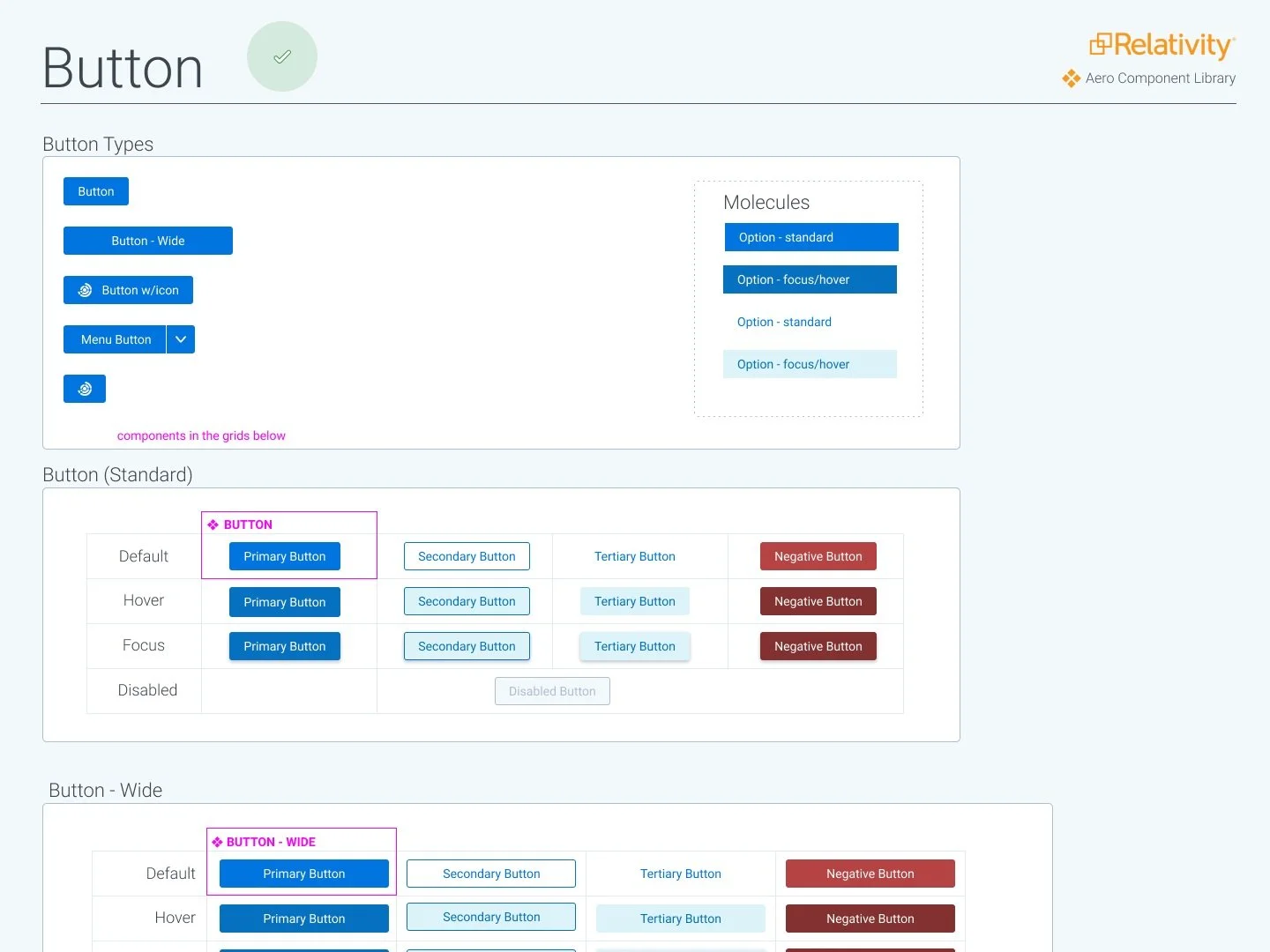
Another key part was bringing the design system into Processing. The current application had been made to look like the Aero UI update that was introduced a couple years prior, but because the infrastructure needed to be synced with the rest of Relativity, it was seriously lacking that ability to tap into the web components that would make building the page much easier.

Something I have learned when making mockups/prototypes is that if they are too simple, it will not draw the best feedback from users, but overly polished doesn’t offer enough room for sharing ideas and encourages the user to solely look for flaws.
Keeping this balance in mind we moved to create hi-fi mockups of what this could look like, starting with radically different concepts that differ from the norm of the design system. It is crucial to always explore these routes even if that means new components have to be introduced into the design system. The design system is a living library and is constantly updated to reflect the needs of our users.


Testing - Evaluating our concepts to eliminate holes
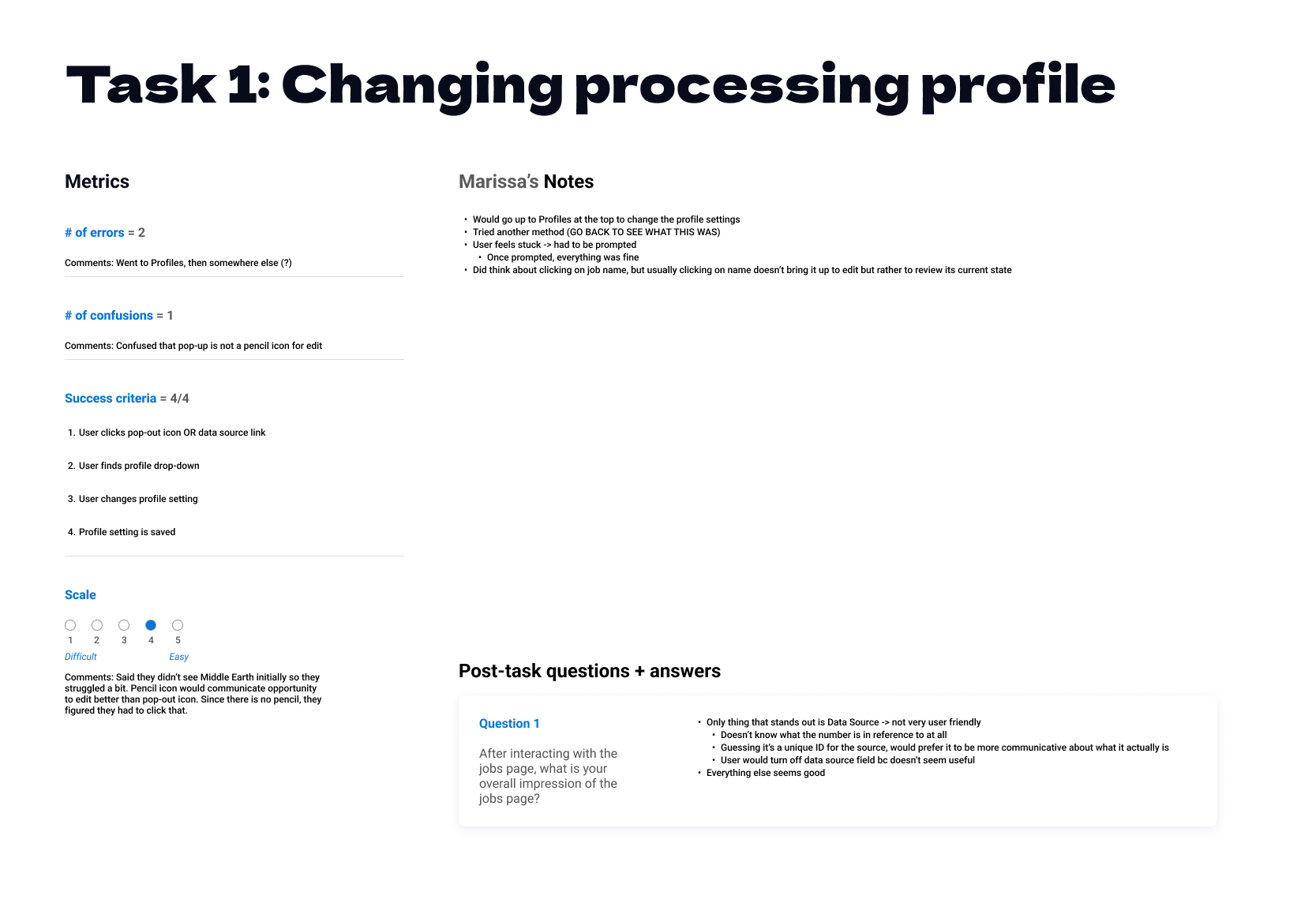
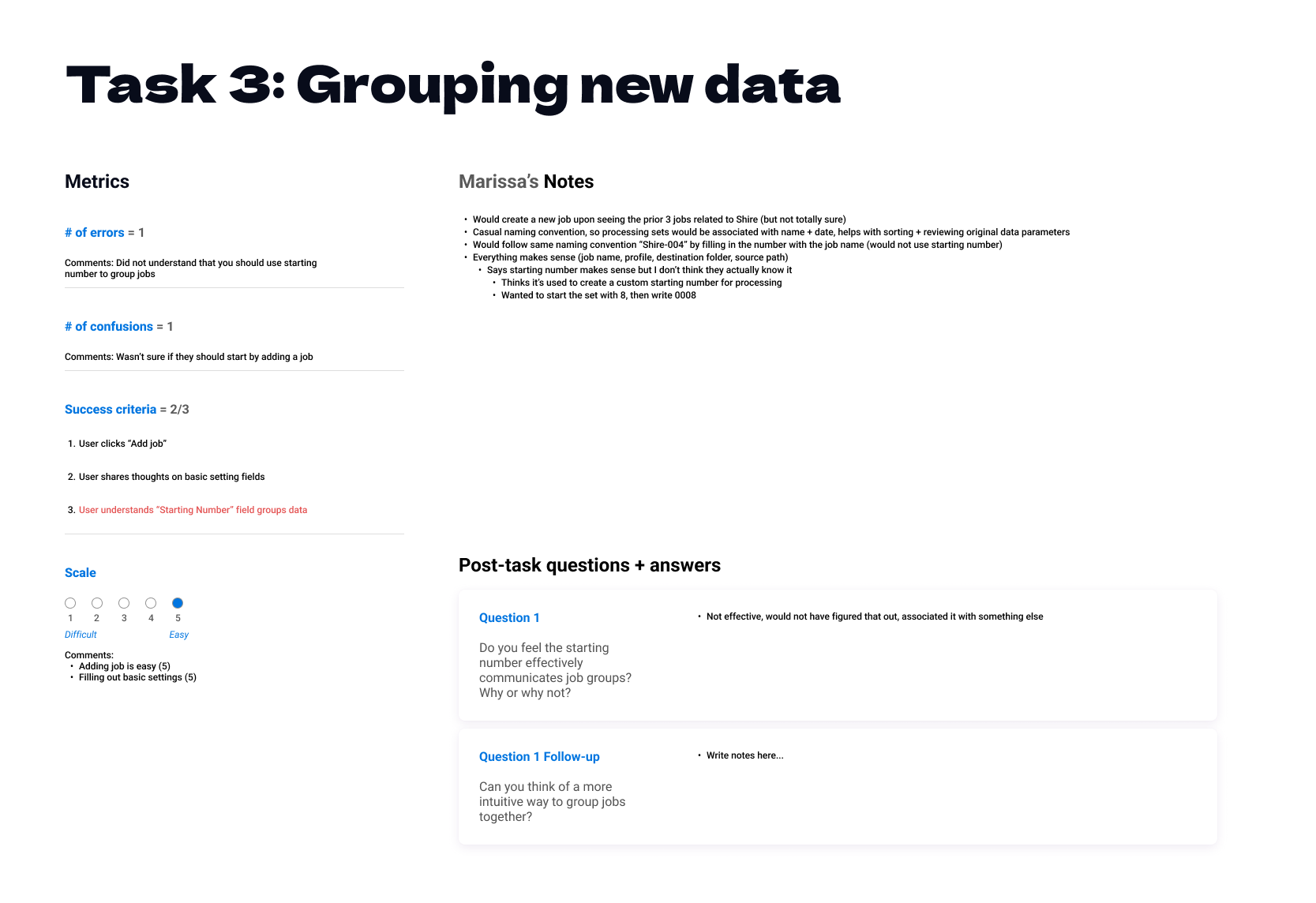
In our first round of usability testing we developed a prototype that would cover 5 key tasks. We purposefully skipped over steps that were not crucial for feedback because of previous light user testing and overwhelming understanding of what needed to be done during those steps. For instance, the concept of clicking add job to kick off adding new data to processing. We utilized the paradigm that the user was familiar with - a button in the upper left corner but instead of saying new processing set like it did previously, we simply changed it to add job
Before building out our script we made a visual representation of the 5 tasks which included the research questions, scenario, task, steps, and success criteria. This would help us build a more natural flow in our script.

Interviews were conducted on a 2:1 ratio, two Relativity members and one user. It is important to limit the amount of people in a session because if too many are present the user starts to feel like they are being tested. Having two members of Relativity present allowed one person to focus on hosting and talking the user through the tasks. The other member would record the notes of how the user was performing these tasks.
We created a template to follow while taking notes but just as we learn about what changes are needed in the product by doing usability testing we realized that the template was too cumbersome and not agile enough to use during the interviews. It was a great template though to use after the fact and organize our findings for each task by user.

Iterations - Incorporating feedback and data to improve
Something I have learned when making mockups/prototypes is that if they are too simple, it will not draw the best feedback from users, but overly polished doesn’t offer enough room for sharing ideas and encourages the user to solely look for flaws.

Using our notes from usability testing, we were able to look at each task and group like responses together. Identifying these trends helped to confirm in some areas that the proposed solution worked effectively but in other areas, like naming conventions, further investigation was needed. Each task had list of suggested changes that could be implemented, ranging from small quick wins like an icon switch for better recognition of the task to larger changes that involve layout rearrangement.
Key Suggestions
-
Simple Naming
Sometimes an idea that you think helps to organize, actually makes it more confusing. If the user can’t understand right away how to use the naming convention, then we already lost them at the very beginning stage. Go back to basics and don’t over-solution.
-
More is More
The backbone of what these users are doing is their data, so the more relevant information about the data we can show, the better. Balancing what is visible right away and what is thoughtfully stored away.
-
Back to Reality
Not everything goes according to plan. The deprecation in another area of the product being postponed means some small tweaks are necessary to fit it back into our workflow.
Conclusion
Through iterations on continuous feedback, we were able to build an experience for our users that allows them to easily process their data to discover the truth. Scope limitations happen but that doesn’t mean you abandon the idea completely; working closely with the triad we were able to create a backlog of future enhancements.